A portrait changes the feeling of a room because we read the person before we read the style. A steady gaze can hold attention across a lounge, a lowered face creates a quieter moment, and an angled close-up can make us feel as though we have arrived halfway through a thought. Choosing portrait art therefore starts with a simple question: how do you want to meet this figure in the room each day?
The history of portraiture offers plenty of references, from sculpted ideals and composed sitters to cameras and self-images. You do not need to choose a period before choosing a canvas. Look at the gaze, the way the figure has been changed, the colours and the outer shape, then test those qualities against the wall you actually have.
Begin with the gaze and expression
Portraits use pose, expression, clothing and surrounding objects to tell us something about a person. Contemporary portrait prints can keep those familiar signals, exaggerate them or interrupt them. That change matters at home because it decides whether a face feels formal, reflective, playful or forceful from the usual viewing distance.
Girl with a Pearl Earring - Broken Prestige Canvas takes an inward route. The young woman studies broken pearl pieces in her hand, with another fractured pearl at her ear. Her lowered gaze keeps the moment private even though violet, red, yellow and cyan make a strong colour statement. It can work near a reading chair or dressing table, where the expression and scattered fragments will often be seen at close range.
 Girl with a Pearl Earring — Broken Prestige Canvas
Mona Lisa - Under Scrutiny Canvas keeps the sitter's steady gaze but places a magnifying glass over her mouth. Hot pink, cyan and yellow replace subdued museum colour, while the circular lens makes the act of looking part of the picture. From a sofa or doorway, the direct face and lens register first. Beside a home-office desk, the smaller details have room to emerge.

 Mona Lisa — Under Scrutiny Canvas
Before comparing palettes, notice which encounter you prefer. A direct gaze creates a visible relationship with someone entering the room. An averted or lowered gaze lets the viewer observe a moment without feeling watched. Neither is automatically calmer or bolder; the crop, colour and size all alter the effect.
Look at what the contemporary treatment changes
The evolution from classical to contemporary portrait art is not a tidy replacement of one style by another. Older faces, poses and ideas remain available, but they can be cropped, recoloured or placed in a new visual context. A familiar reference gives the eye a starting point. The alteration supplies the present-day tension.
That is visible in both canvases above. Broken pearls shift attention from polished status to fragility, while the magnifying glass turns a famous smile into a question about scrutiny. For a wider look at how altered historical references work, read Satire in the Gallery.
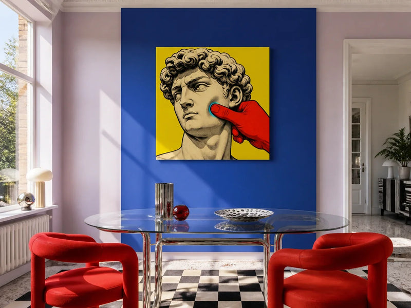
David - Soft Standard Canvas crops close to a familiar sculpted face, angled with its eyes cast sideways. A red-gloved finger presses into the pale cheek, while a cyan halo marks the contact against canary yellow. The image turns an idealised surface unexpectedly soft. Above a reading chair or beside a dressing table, that sideways look and the visual interruption have space to register without dominating the whole room.
 David — Soft Standard Canvas
Facing The Self-Portrait Canvas removes the expected face from the main figure altogether. An instant camera takes its place, while the photograph emerging below holds the missing portrait looking back. Magenta, yellow and electric blue give the image energy, but the exchange between person, camera and picture keeps the question of who controls the portrait open. It suits a creative home office or bedroom where it can be viewed near the cameras, books or personal objects already used there.
 Facing The Self-Portrait Canvas
Let colour set the room's volume
All four portraits use concentrated colour, but they do not ask the same thing of a room. Start with two fixed elements, such as the wall paint and sofa, desk or timber furniture. Choose one colour in the canvas that already relates to those elements, then decide how much contrast you want from the rest.
The violet field and red collar in Girl with a Pearl Earring - Broken Prestige Canvas can sit with dark timber, brass-coloured detail or one plum textile without every object repeating the palette. The pink, cyan and yellow in Mona Lisa - Under Scrutiny Canvas will appear especially sharp against white, pale grey or black.
The canary yellow and red glove in David - Soft Standard Canvas can provide the brightest note in a room with simple black furniture. Facing The Self-Portrait Canvas uses more black around its magenta and yellow, so it may connect readily with a dark desk, shelving or camera equipment.
View the intended wall in daylight and under the lamps you normally use. A colour that looks balanced at noon may feel much stronger in the smaller pool of evening light. For a room-first method that starts with paint and furniture, see the guide to choosing wall art by colour.
Separate portrait subject from portrait orientation
Portrait art describes the subject, not necessarily the shape of the print. All four canvases here are square and available in 40 x 40 cm, 60 x 60 cm and 80 x 80 cm. Their internal compositions behave differently within that same outer boundary. David's face enters at an angle, the Girl's lowered gaze draws attention into her hand, the Mona Lisa faces forward, and the camera figure in Facing The Self-Portrait fills the central space.
A square can hold a compact wall above a sideboard or fill the centre of a chimney breast without stretching towards nearby doors. Its effect still changes with scale. The tight crop of David - Soft Standard Canvas will feel more immediate as the size increases. The direct face in Mona Lisa - Under Scrutiny Canvas remains legible across a room, but its magnifying-glass detail rewards a closer viewpoint.
Mark both the 60 cm and 80 cm outlines with low-tack tape before choosing between them. Include picture rails, switches, door frames and the top of any furniture. Look at the outline from the doorway and main seat, not only while standing directly in front of it. How canvas orientation influences perception explains how the outer proportions relate to the architecture around them.
Decide between one face and a small group
A single portrait gives the gaze, pose and colour a clear role. This works well above a desk, beside an armchair or on a section of wall framed by doorways. If the room already contains patterned textiles or several decorative objects, one portrait with a clean border of wall may be easier to live with than a dense gallery arrangement.
For a pair or gallery wall, connect the works through one deliberate feature. Two square canvases can share an edge line, or a repeated yellow, red or black note can link different subjects. The sideways look in David and lowered gaze in the Girl can form a quieter pairing. Mona Lisa and Facing The Self-Portrait both turn the act of looking into part of the image, giving a group an idea as well as a common palette.
Lay the arrangement on the floor first, then transfer its complete outer boundary to the wall. Keep enough space between faces for each expression to remain readable. Check the grouping from the route through the room, not only from the centre. In a rental, consult the tenancy agreement before drilling. Once the size and position are settled, use Home Art Haven's canvas hanging guide for the fitting steps.
Choose the portrait you will keep noticing
A historical reference may be the first thing you recognise, but the details determine how the canvas lives in the room. Look again at the direction of the gaze, the intensity of the expression and the way the face has been cropped, enlarged or partly hidden. Then compare the strongest colours with the furniture that is staying and tape the exact available size on the wall.
The right portrait is not necessarily the one from your favourite period. It is the one whose face, action or idea remains interesting after the initial recognition, and whose square format works from the places where you will actually see it.