Pop Art still begins with the familiar. A cassette, a clock face, a telephone box or a classical figure can be understood almost at once. The digital-era difference is often found in what happens next: the object repeats until it becomes a pattern, one expected detail disappears, or a solid icon starts to melt.
For a wall-art buyer, that changes what is worth looking for. Bright colour may catch the eye on a screen, but the stronger question is whether the image has a clear visual rule and a deliberate break from it. That relationship needs to work from the doorway and still offer something at close range.
This guide explains how to make that judgement, then use scale, format and room light to decide where a piece belongs. For a closer look at five other works and the ideas behind them, read Beyond Bold Colour.
Find the rule before the surprise
Repetition is one of the quickest ways to turn an ordinary object into graphic structure. A row becomes a grid; a product-like shape becomes a field of colour. The repetition gives your eye a rhythm, so a single interruption carries more weight.
On Repeat Canvas makes that mechanism visible. Twelve red and pink cassettes sit against cyan, with one yellow tape near the centre. The grid feels orderly until black ribbon escapes and sweeps across it. From across a lounge, the colour blocks read first. Near a chair or record shelf, the loose tape and repeated cassette details become clearer.

 On Repeat Canvas
When considering another Pop Art print, briefly ignore the subject and look at the structure. Is there a repeated shape, a strong crop, a single centre of attention or a contrast between order and disruption? If the arrangement is clear, the image is more likely to hold together when it moves from a small product image to a larger wall.
Look for a familiar image that has genuinely changed
A recognisable subject is useful because the viewer brings an expectation to it. The work becomes interesting when the change is specific rather than decorative. Removing, bending or isolating one element can alter the meaning without filling the picture with effects.
Last Public Voice Canvas keeps the red telephone box immediately readable, then lets its base melt into a turquoise puddle. The black window grid remains firm above the drip, while yellow and violet divide the background into simple bands. In a hallway, the silhouette can register while you pass; the melting base asks for a second look.

 Last Public Voice Canvas
Missing Minute Canvas uses subtraction instead. Elizabeth Tower rises in acid green against violet and hot pink, but the clock face has no hands. The omission is small compared with the close architectural crop, yet it changes a symbol of measured time into a pause. Above a desk, that missing mechanism can be noticed slowly; on a living-room wall, the saturated landmark reads clearly from farther away.
 Missing Minute Canvas
These two canvases show why familiarity alone is not enough. Ask what has been changed and whether that change still matters once the novelty has passed. The answer can be playful, uneasy or ambiguous, but it should be visible in the picture rather than supplied by a title alone.
Let distance decide how much detail you need
Digital-era Pop Art often uses crisp outlines and broad colour because they survive quick viewing. That does not mean every piece should be judged only from a thumbnail. Your usual viewing distance changes which part of the design carries the room.
The three square canvases here are available in 40 x 40 cm, 60 x 60 cm and 80 x 80 cm. Mark two likely sizes with low-tack tape, then look from the room entrance and the seat you use most. A smaller On Repeat Canvas may suit a close music corner where the cassette details are easy to see. Across a wider lounge, a larger outline may give the central yellow cassette and loose ribbon enough presence.
Missing Minute Canvas has a different distance test. The tower’s close crop and high colour contrast read quickly, while the absent clock hands reward a nearer look. Make sure surrounding shelves, switches or other pictures do not crowd the square and compete with that small interruption.
If the wall could take several proportions, the guide to canvas orientation and perception offers a fuller comparison of square, portrait and landscape formats.
Match the format to the direction of the idea
Square designs can feel contained and graphic, which suits grids, icons and tightly cropped landmarks. A portrait image creates a different movement, leading the eye up and down the wall.
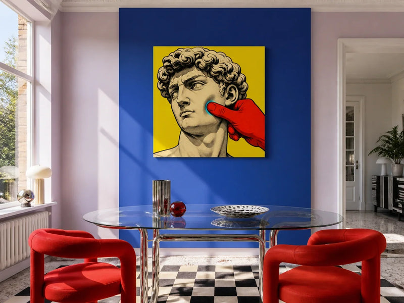
Under Pressure Acrylic Print uses that vertical pull as part of its subject. A composed classical face sits beneath a red screw press between yellow plates, with hot pink and cyan bringing the image into the present. The portrait format is available from 20 x 30 cm to 80 x 120 cm, so it can be tested beside a tall lamp, above a narrow console or on a return wall where a square would leave the space feeling unresolved.
 Under Pressure Acrylic Print
Material changes the decision too. The three canvases have a matte, fine-weave surface, while the acrylic print has a high-gloss face that sharpens colour and responds more visibly to windows and lamps. Check an acrylic position in daylight and after dark. If a bright window sits directly opposite, reflections may interrupt the face and press that give the image its tension.
Keep the room contemporary, not themed
Pop Art does not need a room full of novelty objects. A few quiet materials can make its visual idea easier to read: pale plaster, walnut, oak, plain upholstery or a slim black console. Instead of matching every colour, choose one relationship that already makes sense in the room.
The cyan field in On Repeat Canvas can sit cleanly against warm timber. The turquoise puddle in Last Public Voice Canvas may connect with one glass vase without asking the rest of the hallway to turn blue. Under Pressure Acrylic Print can use a black furniture line or deep neutral wall to steady its pink, yellow and cyan.
Leave enough plain wall for the outer shape to be understood. If other art shares the space, lay the arrangement on the floor or tape paper outlines to the wall first. Several equally forceful grids and saturated figures can compete, while one clear anchor and quieter neighbours are easier to take in.
Choose the disruption you want to keep noticing
The digital age has given Pop Art more ways to repeat, remove and reshape familiar imagery, but those devices only matter when they sharpen the idea. Look past brightness and ask three questions: what is the visual rule, where does it break, and will that break still be readable from the way you use the room?
Once one image answers those questions, mark its listed dimensions, check the wall in your usual light and confirm the fixing suitable for that surface. Then browse the Pop Art collection to compare how other familiar objects and figures are pushed into new territory.