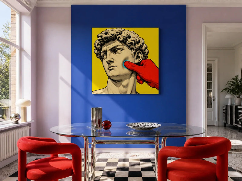
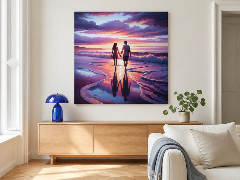
An acrylic print places the image behind a clear, glossy face rather than on a textured canvas surface. The result is crisp colour, polished edges and a frameless profile that can feel particularly at home in a contemporary interior. That same gloss also reflects windows and lamps, so the best choice depends on both the artwork and the wall where it will hang.
Before choosing a size, look at the proposed wall in daylight and under the lighting you use after dark. If the main subject stays clear from the doorway, sofa or dining table, the reflective finish can add depth without becoming a distraction.
From Industrial Innovation to Interior Icon: The Story Behind Acrylic Prints
Acrylic glass began as a material innovation, not an interiors trend. Chemist Otto Röhm's early research into acrylic compounds led his team to polymethyl methacrylate, or PMMA, at the end of the 1920s. Thin transparent sheets followed, registered under the PLEXIGLAS trademark in 1933. Röhm's account of that development records how the material later found uses across product and automotive design.
Its optical clarity eventually made acrylic useful to artists and photographers as well. The Getty Conservation Institute notes that clear PMMA sheets have been used to face-mount photographs since the mid-1980s. In that process, the acrylic sits directly in front of the photograph, removing the visual interruption of a conventional frame and glazing. Getty's conservation research also explains why the pristine surface matters: scratches and chips sit directly in front of the image and are difficult to disguise.
Today's decorative acrylic prints use several production methods, so it is worth checking the specification rather than assuming every panel is face-mounted in the gallery sense. Home Art Haven prints the image directly onto the reverse of a 3 mm clear acrylic panel using UV printing, then adds a white ink layer behind it. You view the artwork through the smooth front face, while the white backing keeps the image opaque and the polished edge leaves the panel looking clean and frameless.
That construction connects the material's industrial story with its place in the home: a thin, rigid panel, a glossy viewing surface and a concealed mounting system rather than a separate frame around the image.
Light, Depth, and Drama: Why Acrylic Prints Transform a Room
The clear layer between your eye and the printed image gives acrylic its characteristic sense of depth. Strong colour can appear saturated, dark areas gain a wet-look gloss, and fine details remain easy to read through the flat surface. Unlike canvas, there is no woven texture to soften the image.
Gloss should still look like gloss. In diffuse daylight, a gentle highlight can reveal the material without covering the artwork. A window or bare lamp reflected across the main subject is more intrusive. Check the empty wall from the places where you normally see it, then repeat the check in the evening. Moving the position slightly, choosing a wall perpendicular to a window or adjusting a nearby lamp can make more difference than changing the artwork.
Kingfisher Dawn Acrylic Print is a useful example of what the format does well. Brilliant blue and rusty orange sit against pale dawn light and rippling water. From across the room, the bird and branch remain distinct; at closer range, the softer water and background become more apparent. A wall with gentle side light lets those contrasts read without placing a bright reflection over the bird.

 Kingfisher Dawn Acrylic Print
For a darker, more dramatic palette, Vibrant Giraffe Duet Acrylic Print brings fiery orange, electric blue and red to a smoky background. Its central pair of giraffes needs a clear view, so check that an evening floor lamp does not reflect across their faces from the sofa. The colours can be picked up with one or two nearby objects, while quieter walls and upholstery keep the artwork as the focus.
Designing with Acrylic: Making It Work in Your Home
Start with the wall shape, not an abstract idea of small, medium or large. The four featured designs in this guide are landscape prints available in 30 x 20 cm, 60 x 40 cm, 90 x 60 cm and 120 x 80 cm. Mark the complete outside edge with low-tack painter's tape and view the rectangle beside the furniture, doors and window reveals. The right size should feel connected to what sits below it while leaving enough clear wall for the polished outline to remain visible.
The mounting system changes with size. The 30 x 20 cm format uses a small hanger set on the reverse. From 60 x 40 cm upwards, a concealed aluminium backframe holds the panel slightly away from the wall, creating a narrow shadow gap without visible front fixings. Read the acrylic print hanging guide before marking the wall, especially in a rental or when the wall construction is uncertain.
Colour and viewing distance help narrow the choice further. Whiskered Trio Acrylic Print uses electric pink, rich blue and glowing amber across three cats with vivid green eyes. Its clear group of faces can hold attention above a sideboard or across a home office. Keep the taped outline clear of tall plants and lamps so the composition does not feel crowded.
A kitchen-diner can also suit acrylic when the print is placed on a dry wall away from the sink, hob, kettle and repeated splashes. Teacup Hen Acrylic Print shows a red hen balanced on patterned teacups, with coral, teal and cream against a soft beige ground. Those colours can connect with ceramics, painted cabinets or pale timber without turning the room into a themed display.
 Teacup Hen Acrylic Print
A wipeable acrylic face does not make every damp location suitable. Home Art Haven does not specify these prints for bathroom steam or splash zones, so choose a dry interior wall. For more room-specific advice, see the guide to decorating kitchen walls. If the proportions are the difficult part, the article on how artwork orientation influences a wall offers a useful next step.
Acrylic Prints and Everyday Living
Art can change what you notice when you enter a room, but it does not prescribe a particular mood. A bright animal portrait may become the first thing you see in a hallway, while a nature scene can give the eye a quieter place to rest in a sitting room. The useful question is not whether one style is universally energising or calming. It is whether the image, colour and finish suit how you use that particular space.
The frameless profile works easily with glass, metal and clean-lined furniture, but it does not require a fully modern room. Soft curtains, timber, woven rugs and painted walls can balance the polished surface. If you are unsure which colours to repeat, choose one secondary hue from the artwork rather than matching every object. The guide to choosing art through colour goes deeper into that decision.
Care is straightforward. Dust the front with a soft, dry microfibre cloth. For fingerprints, use a damp cloth with mild soap, avoiding abrasive cleaners and harsh chemicals that could mark the surface. Handle the polished edges carefully and keep the print away from places where it is likely to be knocked or scratched.
When you have found an image that belongs in the room, let the wall confirm the finish and size. Tape the outline, check the usual viewpoints in daylight and lamplight, and make sure the main subject stays clear of glare. That small rehearsal is the simplest way to enjoy acrylic's colour and depth once the print is hung.