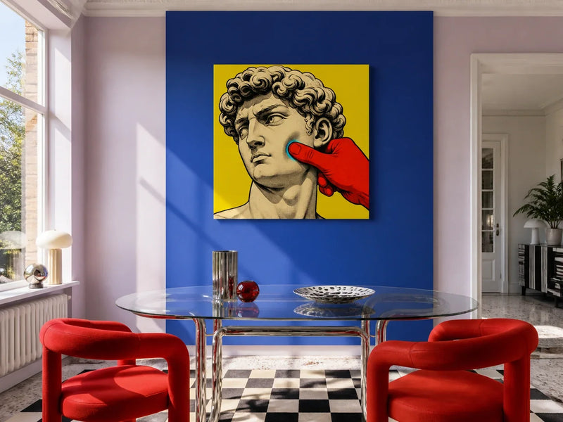
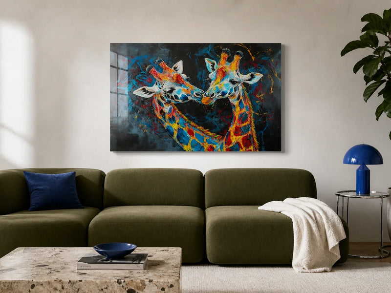
Colour changes what the eye notices first. A pale blue wall can recede quietly, while a small flash of yellow can pull attention across a room. In wall art, hue is only the beginning: lightness, saturation, contrast, subject and scale all affect how a colour feels.
A systematic review of 132 studies on colour and emotion found recurring links between colour categories and feelings, but those associations were many-to-many and changed with the precise hue, its lightness and its saturation. Most studies explored abstract associations rather than proving that a colour will create a particular emotion in a real home.
That makes colour psychology a useful starting point, not a decorating prescription. Use these ten colour families to name the atmosphere you want, then judge the complete artwork in your own light. For a wider order of room, palette, size and print format, begin with How to choose wall art for your home.
The psychology of ten colours
Blue: calm, trust and distance
Blue is often associated with calm, trust and reflection, partly because it recalls open sky and water. Yet it can also suggest coolness, sadness or distance. A dusty blue tends to sit back, while electric blue becomes an active focal point, especially beside red or yellow.
In The Thinker - Cool Thought Acrylic Print, a bronze-toned figure curls around a glowing cyan cube. Hot pink and canary yellow bring energy to the background, but the concentrated blue form remains the visual centre, giving the colour a reflective rather than distant role.

 The Thinker — Cool Thought Acrylic Print
Green: nature, renewal and balance
Green is commonly connected with nature, growth and renewal. Softer sage and olive shades can feel grounded, while lime and acid green demand attention. Its effect also depends on what surrounds it: green beside timber may feel organic, but green against hot pink can become sharp and contemporary.
The vivid snakes in Medusa - Stone Flower Canvas show that green need not be gentle. Cyan, pink, black and the red flower turn it into a colour of tension and transformation, suited to a room where the artwork is meant to lead rather than blend in.

 Medusa — Stone Flower Canvas
Yellow: optimism, warmth and attention
Yellow is often linked with sunlight, optimism and alertness. A muted mustard can add warmth without shouting, while a clean, saturated yellow is difficult for the eye to ignore. Used in a limited area, it can guide attention to the part of an image that matters most.
Walls Of Words Canvas sets a scarlet typewriter and cream paper against mustard yellow, purple and black. The yellow gives the picture warmth and graphic energy, while the darker areas keep it anchored enough for a study, hallway or reading corner.

 Walls Of Words Canvas
Red: energy, passion and warning
Red carries some of the strongest and most varied associations: energy, passion, urgency, danger and celebration. Scarlet feels immediate, whereas brick and burgundy are usually more settled. Because red advances visually, even a small area can become the first thing you see.
That pull is central to Hold The Line Acrylic Print. Its glowing red telephone handset cuts through black scanlines and cyan sparks, giving the image a charged, cinematic presence without covering the whole composition in red.

 Hold The Line Acrylic Print
Purple: imagination, mystery and ceremony
Purple is often associated with imagination, mystery, ceremony and luxury. Those meanings are shaped by culture and personal memory, so the shade matters: lavender can feel airy, while aubergine or ultraviolet has more visual depth and drama.
Penguin in Purple Canvas takes the playful route. Its deep purple ground makes the electric blue, white, orange and yellow details stand forward, creating a lively colour story that can work especially well where you want character rather than formality.

 Penguin in Purple Canvas
Orange: warmth, movement and sociability
Orange combines some of yellow's warmth with some of red's energy. It is often read as lively, sociable and welcoming, although a burnt orange feels more grounded than a bright tangerine. Against blue, orange gains extra intensity because the two colours strongly contrast.
In Tune The Morning Acrylic Print, an orange sunset glows inside a deep navy radio. The surrounding blue gives the warmth a clear boundary, so the piece can bring an inviting note to a kitchen-diner or living space without overwhelming it.

 Tune The Morning Acrylic Print
Pink: affection, softness and play
Pink is commonly associated with affection, care, softness and play, but the family covers very different moods. Blush can act almost like a warm neutral, while hot pink is bold and irreverent. Pairing it with black or cyan moves it well away from a delicate look.
Under Pressure Acrylic Print uses hot pink with cyan, yellow and red around a classical figure caught beneath a screw press. Here pink contributes wit and intensity, proving that the colour can feel challenging as well as sweet.

 Under Pressure Acrylic Print
Grey: restraint, balance and quiet
Grey is associated with neutrality, restraint and balance. Pale silver can make a room feel open, while charcoal gives definition and weight. A large expanse of similar mid-grey may feel subdued, so texture, line and small shifts in tone are important when grey is the main event.
The overlapping circles and soft radiating lines of Grey Harmony Canvas use those tonal differences to create movement. It is a useful choice when you want the artwork to add structure without introducing a competing accent colour.

 Grey Harmony Canvas
White: clarity, space and simplicity
White is often linked with clarity, cleanliness, space and simplicity. Yet it is never entirely neutral: cool white can appear crisp or stark, while cream and warm white feel softer beside timber and natural textiles. In artwork, white also creates breathing room around darker forms.
Monochrome Rose Elegance Canvas uses a white field to reveal the curves and shadows of an abstract black rose. The result is high contrast but visually spare, making it easier to connect with a neutral room than a densely coloured image.

 Monochrome Rose Elegance Canvas
Black: strength, depth and definition
Black is often associated with strength, sophistication, mystery and depth. It gives other colours a firm edge and can make luminous details appear brighter. Scale matters, though: a small black accent adds definition, while a large dark field has much greater visual weight.
The black background of Choosing Offline Acrylic Print holds a cybernetic figure, cyan cable and hot-pink details in sharp focus. It suits a space where depth and contrast are welcome, particularly when nearby walls, flooring or furniture provide a lighter counterpoint.

 Choosing Offline Acrylic Print
Let light, size and surface change the answer
Colour on a screen is backlit. On your wall it will depend on daylight, lamps, paint and the print surface. Check the intended spot in the morning and after dark. Canvas has a matte fabric face that softens hard reflections, while acrylic has a smooth, glossy face that can make saturated colour feel especially crisp but may reflect a nearby window or bare bulb.
Size changes the experience too. A small patch of red or black can be an accent; the same palette at a much larger scale can dominate the wall. Mark the listed dimensions with low-tack tape, then view the outline from the doorway and the seat you use most. The guide to digital art in home decor explores detail, viewing distance and print surface, while The Psychology of Shape can help with square, portrait and landscape proportions.
Finally, choose one existing element, such as the sofa, rug, curtains or timber floor, and compare it with the artwork. Repeat one colour for continuity, choose a contrasting note for energy, or let a neutral material sit between several bright shades. You do not need to match every colour. The most useful question is what the complete image does in your light, at your chosen size, beside the things you already live with.