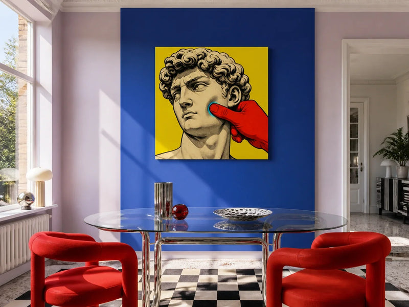
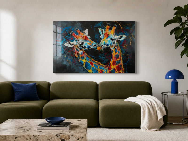
Colour changes a room before we move a single piece of furniture. A deep blue wall can make daylight feel cooler. A small area of orange can draw attention across a neutral space. Green may recall a garden for one person and a school uniform for another.
These responses are real, but they are also personal. That distinction matters when colour is discussed alongside wellbeing. Chromotherapy, sometimes called colour therapy, is based on the idea that particular colours or coloured light can improve health. Its history is often presented as proof that it works, yet a long history does not establish a medical effect.
Wall art can help us shape an atmosphere, notice what we enjoy and make a room feel considered. It should not be described as a treatment for stress, anxiety, pain or any other health condition.
Why colour affects the way a room feels
Colour is never seen on its own. Light, scale, neighbouring colours and the material beneath it all change the result. A pale blue print beside a north-facing window may look cool and quiet. The same blue under a warm evening lamp may appear softer and greyer.
Personal association matters too. Yellow might recall summer, a favourite kitchen or a high-visibility warning. Red may feel lively in a dining room but too insistent beside a desk. There is no reliable chart that can tell every person how a colour will make them feel.
This is why colour choices work better as experiments than prescriptions. Instead of deciding that blue must calm you or orange must energise you, notice your own response at the time and in the room where the art will live.

Chromotherapy is not the same as choosing a palette
People have connected colour, light and health in many periods and traditions. Modern chromotherapy continues that idea by assigning physical or emotional effects to specific hues. Those claims should be separated from the ordinary experience of enjoying colour.
Choosing a green landscape because it reminds you to look up from a screen is a personal decorating decision. Using a softer palette in a bedroom because you find it less visually busy is another. Neither proves that green heals or that muted colour produces a clinical result.
There are established medical uses of light, delivered in controlled conditions for particular purposes. That does not mean decorative coloured light or artwork has the same effect. Anyone seeking help with physical or mental health should use qualified healthcare guidance rather than relying on a colour scheme.
Choose colour by activity, light and preference
A useful palette begins with the room rather than a list of supposed colour powers.
In a workspace, decide whether you want the artwork to be a clear focal point or a quieter background. Strong contrast is easier to notice from across the room, while closely related tones may demand less attention during concentrated work.
In a bedroom, view the colours under the lamps used at night. A print that feels gentle in daylight can become much darker after sunset. In a living room, check it from the seat used most often and against the largest areas of colour, such as the sofa, curtains and rug.
Try these questions:
- Which colours do you already enjoy living with?
- Does the artwork still appeal in morning and evening light?
- Is the contrast comfortable from your normal viewing distance?
- Does one colour connect naturally with something already in the room?

Use colour as a cue, not a cure
Art can support a routine without being responsible for its outcome. A picture near a reading chair may mark a place where you put your phone down. A colourful print in a kitchen can make an everyday breakfast corner feel cared for. A familiar landscape may bring back a memory when you pause to look at it.
The helpful part is often the habit around the object: stopping, noticing, breathing normally or making time for an activity you value. The artwork is a visual cue within that routine, not a substitute for rest, treatment or support.
Our guide to choosing art through colour takes the practical process further, including how to test a palette against the room you already have.
Colour can make a home livelier, quieter, warmer or cooler to the people who live there. Treat those words as descriptions, not promises. The best evidence is your own sustained response to the artwork in its real light and setting.